Research
08/09/17- This is the spec for the whole course, I can refer to this for completing this coursework
http://www.arts.ac.uk/media/arts/about-ual/ual-awarding-body/documents/specs-statements-and-letters/cmpt/l3-cmpt/Level-3-Creative-Media-specification-v5.1.pdf
- This was a tutorial for Photoshop. I was able to colour shapes. Use different brushes, depending on the hardness and size. The floating egg Photoshop can resemble a surrealist artwork like Rene Magritte's pieces.


11/09/17
- This time, I learnt how to make a London including all the pictures that represent London within the letters of "London" I used tools like the magic wand tool, marquee tool and layers to help me create this design. I am now looking at how to make a shadow making the words look more three dimensional.

21/09/17

I used a tutorial on this website, https://design.tutsplus.com/tutorials/create-a-photo-realistic-iphone-in-photoshop--psd-10330 to help me design an Iphone by using several tools known to me plus a few more I experimented on, I was about to completely make an Iphone with a background showing. I used tools like the Marquee Tool, Magic Wand Tool, Crop Tool etc, to help me discover and experiment and finally finish the product that was needed to be made.
28/09/17
 I was experimenting on the different adjustment levels on Photoshop. By adjusting the RGB Levels (Red, Green,Blue) I was able to change the overexposed picture to a reasonable exposure and able to Photoshop the picture to a respectable exposure level. Learning about adjustment levels on photoshop expands my knowledge about photoshop and teaches me about how to use it
03/10/17

Darken


Multiply
I have been experimenting on different blend modes and the different groups they are sorted in. This pictures placed here are part of the Darken sections of the Blend Group. There are different sections within the Blend Modes Group that help change the images' blend mode they are Normal, Darken, Lighten, Contrast, Inversion, Cancellation and Component.

I have also been experimenting with curves on Photoshop. Curves helps adjust tones to the image for example, how to brighten or darken the image. I was able change the contract and shift the colours of the image to make it light or dark. It is considered to be one of the most advanced tool to use in Photoshop.28/09/17
 I was experimenting on the different adjustment levels on Photoshop. By adjusting the RGB Levels (Red, Green,Blue) I was able to change the overexposed picture to a reasonable exposure and able to Photoshop the picture to a respectable exposure level. Learning about adjustment levels on photoshop expands my knowledge about photoshop and teaches me about how to use it
03/10/17
Blend Modes

Darken

Colour Burn


15/09/17
 Today, we followed a tutorial to make a calendar with our own choice of background, font colour and date background colour within Photoshop. I used a layer style to help me design the font of the '2017', calendar numbers and the months to help me design and bring a more neon vibe towards the calendar design.
We also learnt about adjustments. In the image shown I used a Black and White adjustment in one picture and Brightness/Contrast in the other picture below it. I was also able to link an adjustment to each image so the rest of the images on the page will not be affected by the adjustment on one of the images.
26/09/17

I followed a tutorial on how to follow instructions to make a minion. We followed instructions to make this minions on this website http://www.vfxmaximum.com/digital-art-create-minion-from-despicable-me-in-photoshop/ I was able to learn about different tools within the tutorial and see what effects it has on the image. I was about to see the minion coming along and decided to feature some of the tools into the comedy posters I am making.

Text warp around an image
14/11/17

Using templates with InDesign. Making a business card using a template from adobe.

Text warp around an image
14/11/17

Using templates with InDesign. Making a business card using a template from adobe.
13/09/17
- Using the Link http://www.filmsite.org/comedyfilms.html I've found some facts to help me research about comedy films, where they first started and where they have transitioned from when they were first shown.
- Slapsick comedy was the earliest type of comedy and were tend to be silent majority of the time. Sound wasn't usually used which made it more effective towards people who did not speak English. The word 'Slapstick' came from the noise made when clowns slapped wooden sticks together to promote the audience reaction and cheers. This was mainly a physical comedy where people e.g fall over or hurt themselves.
- Dark comedy was sarcastic or sardonic comedy which helped search for darker subjects like war. One example, Stanley Kubrick's Cold War was a classic satire which made audience see the realness within the war and how it makes jokes about the war to ease the tension of the after effect of the Cold War.
- Satire and spoof comedy is usually about events in the news and they make funny stories to undermine the seriousness in the news event. They usually have an impersonation or mimics the style of characters or situations.
- Screwball comedy is usually based on romantic stories. They were very popular within the mid 1930's to mid 1940's. the word 'screwball' usually associates with craziness or erratic behavior.
Research For Poster

Grown Ups is a slapstick and verbal comedy from what is shown on the movie poster. The film is based on five families going to a lakeside for the five fathers high school coach's funeral. You can tell this is going to be a comedy due to the codes and conventions which are shown through the movie poster for example, the fact that all the grown men are on a water slide shows that they are remembering their childhood and still acting like boys as they are grown men with families. The tag line "Boys will be boys...some longer than others" tells us about how they characters are still acting like children and due to the fact that they are adults it makes the film more funny because they are meant to be more mature. This makes the audience, who are above the age of 12, believe that this is meant to be a comedy, especially as most of the actors known are featured in other comedy films; it is expected to know that this film will be too for example, Adam Sandler has been in many successful comedy films like Happy Gilmore, Zohan and Mall Cop. As he and Kevin James are at the front of the trail of the water slide, this suggests that the are both foregrounded and idealized to be the main characters on the movie with less mentioned characters further down the line. Also, all the characters are seen smiling and enjoying themselves which shows that the film is meant to be enjoyable and have a good reaction within the audience which is presented to. Columbia Pictures, Which is owned by Sony Pictures, produced the movie but Sony Pictures Releasing distributed the movie around the UK with a UK first weekend Gross of (1)£2,006,945 with a budget of $80,000,000 (£107,976,784) showing in around 401 screens nationwide. The film ended up becoming a franchise while making a grown ups sequel which ended up being a box office hit. However, it did not show within the UK most probably due to it's response to the previous showing and it's rating. Grown ups 2 had the same budget of $80,000,000 (£107,976,784) and had a first weekend gross of $41,508,572 (£30,742,536) meaning that the sequel did better that the first film in America only as the company doubled their money throughout both films. First week the (2)DVD sales in the US they sold 772,072 DVD's and got a total number of $15,433,719 (£11,428,151) and Blu-Ray sales in the US they sold 146,995 in the first week and got a total number of $3,432,323 (£2,541,520).
(1)http://www.the-numbers.com/movie/Grown-Ups#tab=video-sales
(2)http://www.imdb.com/title/tt1375670/
(1)http://www.the-numbers.com/movie/Grown-Ups#tab=video-sales
(2)http://www.imdb.com/title/tt1375670/
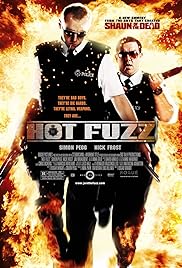
Hot Fuzz is a satire comedy about a award winning police officer who has moved to a suburb area to help find a killer with the help of a trainee officer. This movie mimics the roles of police officers in suburb areas as the secondary officer doesn't know what to do. The movie poster shows an explosion in the background of two police officers walking. This show humour because the audience would not usually see police officers acting as spies or be used for be jobs. This spoofs spies as well because movies like James Bond are usually serious while Hot Fuzz creates humour to place British Police Officers in their shoes. It shows how Police Officers are stereotypically seen as the bad guys or in films the ones who are always seen to miss the obvious as one person will always be one step ahead. This represents them as a joke towards the audience as it creates a positive reaction towards the film because it shows the comical and funny version of two police officer who the audience would never usually see. It also puts an image on the police officers especially towards the people who do not really like the police, it sets a bad example as it could influence them or younger and more vulnerable people to disrespect them in real life. The tagline "They're bad boys,They're die hards, They're lethal weapons, They are..." shows us how they are meant to be taken seriously. However, they are purposely meant to have a hero and a sidekick so they are similar to Batman and Robin were Robin is like the trainee. The tagline also uses exaggeration to give an idea that it is a comedy because they are just police officers doing their job. The explosion signifies how this movie will be a hybrid between an action and comedy movie. The mis-en-scene of the movie shows that they are meant to be police officers due to the costume and props they use however, the characters are holding shot guns suggesting that this is action film with a bit of comedy as police officers are not usually seen with shotguns. Universal Studios presents Hot Fuzz and it is in association with StudioCanal. It has many other distributors like Paramount Pictures and Universal Studio International. (1) The film had a budget of £8,000,000 and in its first weekend showing in 427 screens in the UK made £5,518,149. (2) In the US, the first week it came out on DVD it sold 853,947 DVD's which made $14,628,112 (£10,870,100). It was on shop floors for 5 weeks before being taken of and the company made a profit of $25,230,423 (£18,748,642). With Blu-Ray sales, the first and only week they sold 6,667 units sold and made a profit of $119,200 (£88,577).
(1) http://www.imdb.com/title/tt0425112/
(2) http://www.the-numbers.com/movie/Hot-Fuzz#tab=video-sales

(1) http://www.imdb.com/title/tt0196229/business?ref_=tt_dt_bus
(2) http://www.the-numbers.com/movies/franchise/Zoolander#tab=summary
(3) http://www.imdb.com/title/tt1608290/business?ref_=tt_dt_bus
20/09/17


This is the comedy moodboard I am working off to inspire myself on which type of comedy to use. Overall, I believe I should go for a verbal comedy as there are many examples on the internet that can inspire me and help me create a really good and impressive one. They can also be a checklist for what I need to create a verbal poster. I was also considering to make a satire comedy poster as it is very easy to make a comedy about current events without offending so it would be easy to fit my thoughts and ideas into a poster describing what I and other people may think about a certain thing in the news.
Planning and Pre-Production


The images shown my plans for my final poster. These are the plans for the poster film going form the storyline to the tagline and the design of the comedy poster. I analysed everything from other comedy films and how they are present the characters on their front covers. This is the first development from the comedy poster I will be creating. There are multiple storylines that I created but I decided to stick with the babysitter story because I wanted to explore how I can develop a normal situation like a babysitter looking after children can be amusing like My Babysitter is Vampire, The Sitter or Daddy Day Care. I also decide to go for a Horrible Bosses/ Monsters Inc. design because the age rating of my comedy film is 12A. I was inspired by the Monster Inc title screen because it is very colourful and could look attracted towards people 12 and above. The reason I have rated this comedy 12A is because I have seen other British Board of Film Classification and I have seen what it criteria has to be involved for the film to be a 12A. The film that I am creating a poster for has limited violence which isn't potentially dangerous that young children aren't able to copy.

(1) http://www.bbfc.co.uk/what-classification/12a-and-12
 Originally, I was going to design a poster with no photography involved however, it was ending up with a PG looking poster for little children. I wanted it to look more of a 12A film and not a childlike film. I decided to scrap the idea because the idea was very plain and simple and would have taken me ages to complete the comedy poster like how it was presented. I figured out that not adding pictures that I've taken makes the poster not add any emotion or character to the storyline because it seems really emotionless and a typical,stereotypical storyline.

Final Product


Evaluation
Section One:Research
 To start off my Pre-Production, I was asked to make a draft of my comedy posters. I started to think about what would be involved in a 12A film poster so, to start off I continued to research about 12A films on the British Board of Classification (BBFC) site. This helped me find a guideline on what the comedy posters should present. I also searched 12A movie posters to see what they have presented on their covers. I figured out that there should be a limited amount of explicit content on the movie poster. So, originally I started to make up titles. storylines, taglines, characters and location. I made a plan about what would be most effective as a comedy storyline to make sure my poster is matching the information showing on my plan. I also made a draft about my comedy movie poster which was matching my plan. I planned to make boxes of the main characters at first showing their personalities through the movie poster to get the audience to if it is their type of movie. I was going to have their faces split within each box and a different colour in each box. I was basing my storylines on comedy movies which include babysitters. I ended up going for a monsters inc type of comedy poster with all graphics. I ended up scrapping the idea because it was hard to get silhouettes of people doing actions and I believe that it was looking very boring in the end. So I decided to start again and include my own photos onto the movie poster to add more character and to make it more realistic. I decided to call it "Oh baby" because it resembles all the main characters on the main comedy poster. Originally, it was going to be called "Manage the babysitter" however, I didn't think that was a very catchy comedy title and it wasn't very amusing either.
Section Three:Production/Product
 First of all, I took pictures of three children with different emotions on their face. I needed each of their expressions to be different because it represents how the storyline is constructed. I decided to the first picture is of a girl having fun in a park, the middle one is meant to be representing a girl with an attitude and the boy is meant to represent someone who is completely clueless and just happy with everything. I decided to use split screen effect on the poster to make sure that the main character is foregrounded at the front of the poster and to tell the audience that the storyline is about that character. I decided to use the Kirsten ITC font with a shadow drop because I decided that it makes the font look more childlike and match with the pictures. It also makes the writing stand out towards the target audience so they aren't mostly distracted by the pictures of the children behind the information that need to know to watch it in the cinemas. I added the content of the movie at the bottom of the poster to add authenticity through the poster and to present it as an actual poster on the street. I added the gradual effect on the background of the poster to show the image. I added the institutional information and the credit block to show who is featured and who I think this film would be suitable to produce and distribute this movie. I chose the Walt Disney Company to produce this film because they have made similar film posters to this comedy poster and I believe that their distributor, Buena Vista Distribution Company, is very well known and can distribute this movie worldwide. I got the inspiration to add a credit block for other movie posters I have researched before and decided to make this look real and genuine, I would add one. This gives the target audience insight into who produced it, who distributed it, who is involved, the backstage team etc. The font colour is very eye catching especially against a dark background and I added a drop shadow to make it appear off the poster; right into peoples face almost. I included the movie date in pink as well because that is part of the most important information on the poster which needs to be bright, readable and noticeable.
Section One:Research
For this project I was asked to produce two comedy movie posters. For my research, I used primary, secondary, qualitative and quantitative data to help me construct my research on what an ideal comedy poster should be. I analysed 3 very well known comedy films, Grown Ups, Hot Fuzz and Zoolander. I used the search engine 'Google' to help me find information for the three posters I was analysing and used websites such as www.imdb.com and www.the-numbers.com which are known to be very reliable due to the people uploading the information are independent journalists reviewing each film and their box office figures. With each poster I analysed the mis-en-scene of the poster e.g costumes, make-up, body language etc, I was able to find out how each character was portrayed on the poster and how they are foregrounded to be as well. I was also able to research about the companies who made the films and how successful the film was due to their box office figures.Grown Ups did not do as well in England than they did in America, which is the reason why the released the second film only in America. Hot Fuzz made a lot of profit as their budget was £8,000,000 and they made £5,518,149 within the first opening weekend. While with Zoolander, in the UK their opening weekend was not great with a starting figure of £676,518. I was able to get all my quantitative data from IMDb and the numbers which show most of the movies information and all the box office figures I needed to help my research. My qualitative data included myself talking about the camera angles and the mis-en-scene for example, how they are each presented through their body language to make the characters personalities come through the poster especially in the Zoolander poster; how the main character is in an unusual position which portrays the poster as a comedy poster and creates a very effective message that passes through the poster as a comedy.
Section Two:Pre-Production and Planning
To start off my Pre-Production, I was asked to make a draft of my comedy posters. I started to think about what would be involved in a 12A film poster so, to start off I continued to research about 12A films on the British Board of Classification (BBFC) site. This helped me find a guideline on what the comedy posters should present. I also searched 12A movie posters to see what they have presented on their covers. I figured out that there should be a limited amount of explicit content on the movie poster. So, originally I started to make up titles. storylines, taglines, characters and location. I made a plan about what would be most effective as a comedy storyline to make sure my poster is matching the information showing on my plan. I also made a draft about my comedy movie poster which was matching my plan. I planned to make boxes of the main characters at first showing their personalities through the movie poster to get the audience to if it is their type of movie. I was going to have their faces split within each box and a different colour in each box. I was basing my storylines on comedy movies which include babysitters. I ended up going for a monsters inc type of comedy poster with all graphics. I ended up scrapping the idea because it was hard to get silhouettes of people doing actions and I believe that it was looking very boring in the end. So I decided to start again and include my own photos onto the movie poster to add more character and to make it more realistic. I decided to call it "Oh baby" because it resembles all the main characters on the main comedy poster. Originally, it was going to be called "Manage the babysitter" however, I didn't think that was a very catchy comedy title and it wasn't very amusing either. Section Three:Production/Product

Section Four:Evaluation


This is the final image after adding adjustment layers to even out the brightness in each picture. Also, trying to make the bottom of the photos even. To make the poster more filled I decided to move the tagline further down. Overall, I think that if I had more time and became more prepared about the project then I could have improved it more for example, I would be able to take more photos to fill in the emptiness in the poster with more photos about the topic of the movie. I would also have more contrast on the photos to make them all look the same instead of different brightness on each photo. I would have added a fade at the bottom of the photos to blend into the background to make me less block like. I could have worked more on making the bus stop advertisement differ from the movie poster , if i had enough time I would add more baby/toddler images to make the image seem less empty and differ from the other poster. I would also change the colour of the font on the credit block; I would not make it grey and make it slightly less visible and smaller because it seems like that is what is taking up the most of the poster. Overall, I think I have done okay with this task but if I had to do this task again; I would make sure I time plan what I would do and learn more tasks on photoshop to advance my skills and have more creativity on the comedy poster.
Bibliography
I referred to this website to find different types of comedy, the codes conventions and categories.
I used two different websites to find realistic figures about the movie posters I have analysed.
No comments:
Post a Comment